PNG vs WebP for Websites: A Practical Test with UI Screenshots, Photos, and Transparent Graphics
A browser-based PNG vs WebP comparison using UI screenshots, photo-like images, and transparent graphics, with measured sizes and a practical format workflow.
The short answer
For final web delivery, test WebP first, but do not turn that into a rule to convert every PNG. Keep PNG when you need a lossless editing or archive master, crisp text and hard edges, or a compatibility fallback. Use WebP when the measured output is materially smaller at an acceptable visual error and your browser-support policy allows it.
That distinction matters because the same conversion gave three very different results in a controlled QuickShed browser test. The photo-like fixture became 83.02% smaller at quality 92 and 88.75% smaller at quality 80. The UI screenshot-like fixture became 88.36% larger at quality 92 and 28.63% larger at quality 80. The transparent graphic became 9.13% larger at quality 92, but 7.80% smaller at quality 80. Both QuickShed trials used lossy WebP at those two quality settings; no lossless WebP conversion was tested. WebP is a useful delivery option, but it is not a guaranteed size win.
PNG vs WebP at a glance
| Situation | Sensible starting point | Why | Check before shipping | |---|---|---|---| | Photos and rich textures | WebP, often quality 80–92 | The photo fixture compressed substantially while preserving dimensions | Inspect representative detail and compare bytes | | Screenshots, diagrams, and small text | PNG or a tested WebP | PNG is lossless; our UI fixture was smaller as PNG | Zoom text, 1px rules, icons, and flat-color edges | | Transparent logos and graphics | Test WebP and PNG side by side | WebP supports alpha; the alpha fixture preserved decoded alpha in this run | Check edges, shadows, and alpha against the intended background | | Editing, archival, or exact source preservation | PNG or another lossless master | Keep the master separate from delivery derivatives | Confirm that the format used for delivery is the one you intended | | Exact decoded-pixel preservation | A lossless master plus PNG or another verified lossless encoding | Lossy WebP was used in this trial, so these outputs are not exact-pixel references | Compare decoded pixels when exact equality matters | | Older-browser or application support | PNG fallback plus WebP where appropriate | WebP support is broad, but not the same as universal support | Verify the actual support floor and fallback path |
Use the table as a starting point, not a promise about every image. A format decision is only useful when it is tied to the image’s content, the delivery audience, and measured output.
What the formats actually give you
PNG’s current W3C specification describes PNG as a lossless format for portable, well-compressed storage of raster images, with indexed-color, grayscale, and truecolor support plus an optional alpha channel.[1] Lossless means the encoding does not intentionally discard pixel information. For exact-pixel preservation, keep a lossless master and use PNG or another encoding you have verified as lossless for the required path. This trial did not test lossless WebP; its WebP outputs were lossy.
WebP is more flexible rather than simply better. MDN describes it as a format with lossy and lossless compression, transparency, animation support, and broad support in current Chrome, Edge, Firefox, Opera, and Safari releases.[2] RFC 9649 specifies the WebP container and its lossy, lossless, animation, alpha, and lossless-bitstream components.[3] In practical terms, WebP can serve both photographic delivery and transparent graphics, but the encoder mode and settings still determine the trade-off.
A quality number is not a universal visual-quality scale. In the QuickShed Image Format Converter, the browser draws the selected image to a canvas and calls canvas.toBlob() with quality / 100 for WebP. In this trial, quality 92 and quality 80 produced lossy WebP outputs. They describe this browser encoder invocation; they do not mean that every encoder, browser, or image will produce the same size or the same visual result.
The browser format guide also makes the compatibility trade-off explicit: WebP is an excellent choice for images and animated images, while PNG remains useful when precise reproduction or transparency is important; the guide lists WebP support across major current browsers but does not treat it as the same historical-compatibility baseline as PNG.[2] If your support floor includes an environment that cannot decode WebP, use a fallback rather than turning a format preference into a broken image.
The controlled test
I tested three synthetic PNG fixtures with no external image assets:
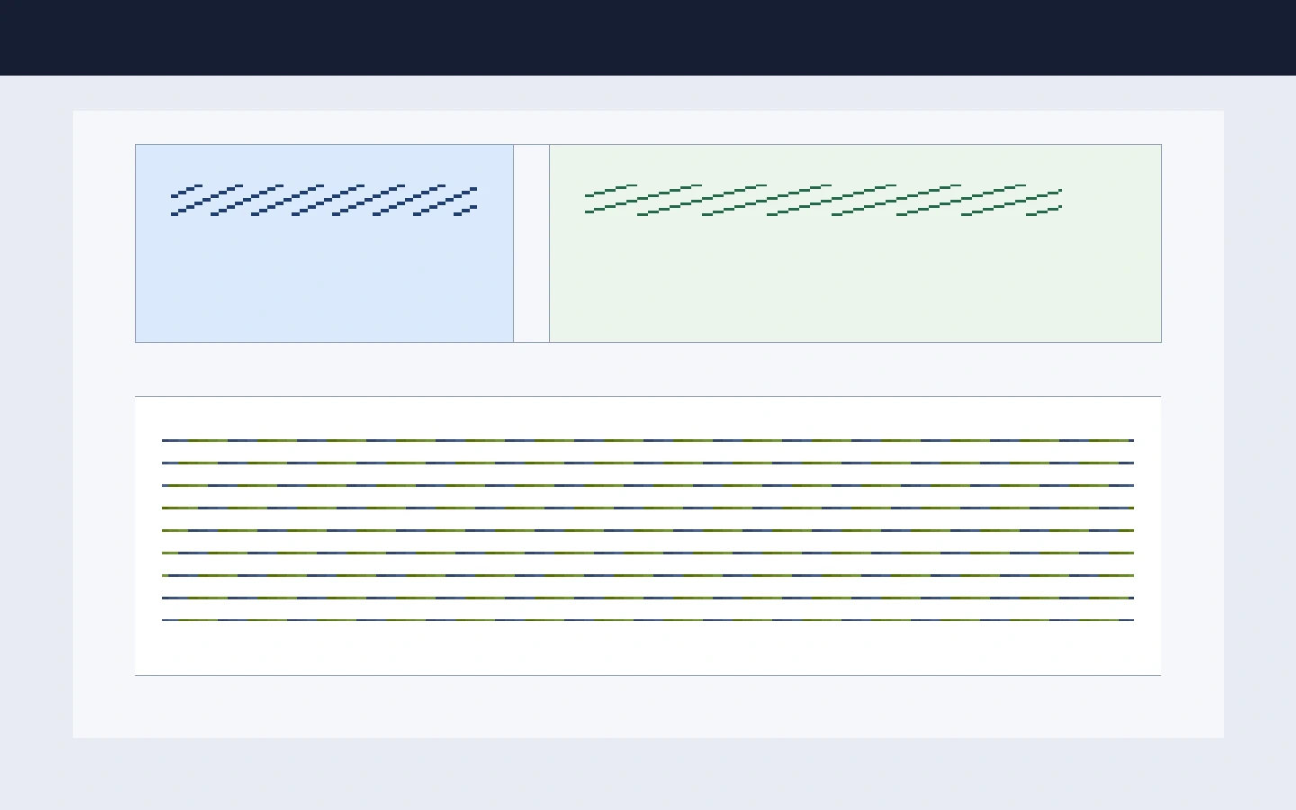
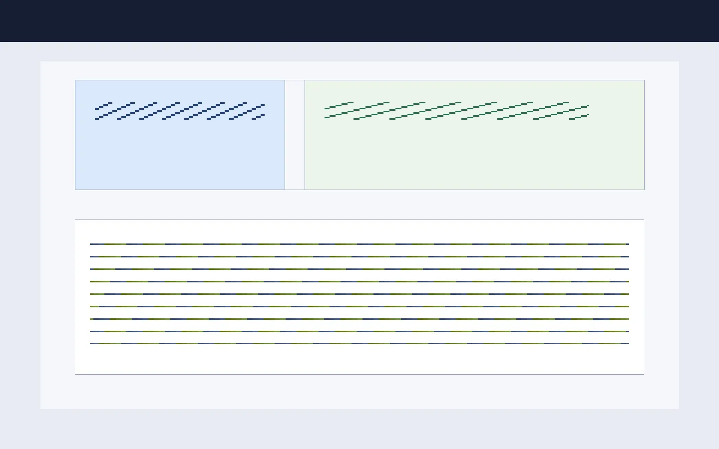
- UI screenshot-like: 1,440 × 900, including small text-like runs, icons, flat fills, 1px rules, and high-contrast edges.
- Photo-like: 1,600 × 1,067, deterministic gradient/noise/color texture with seed
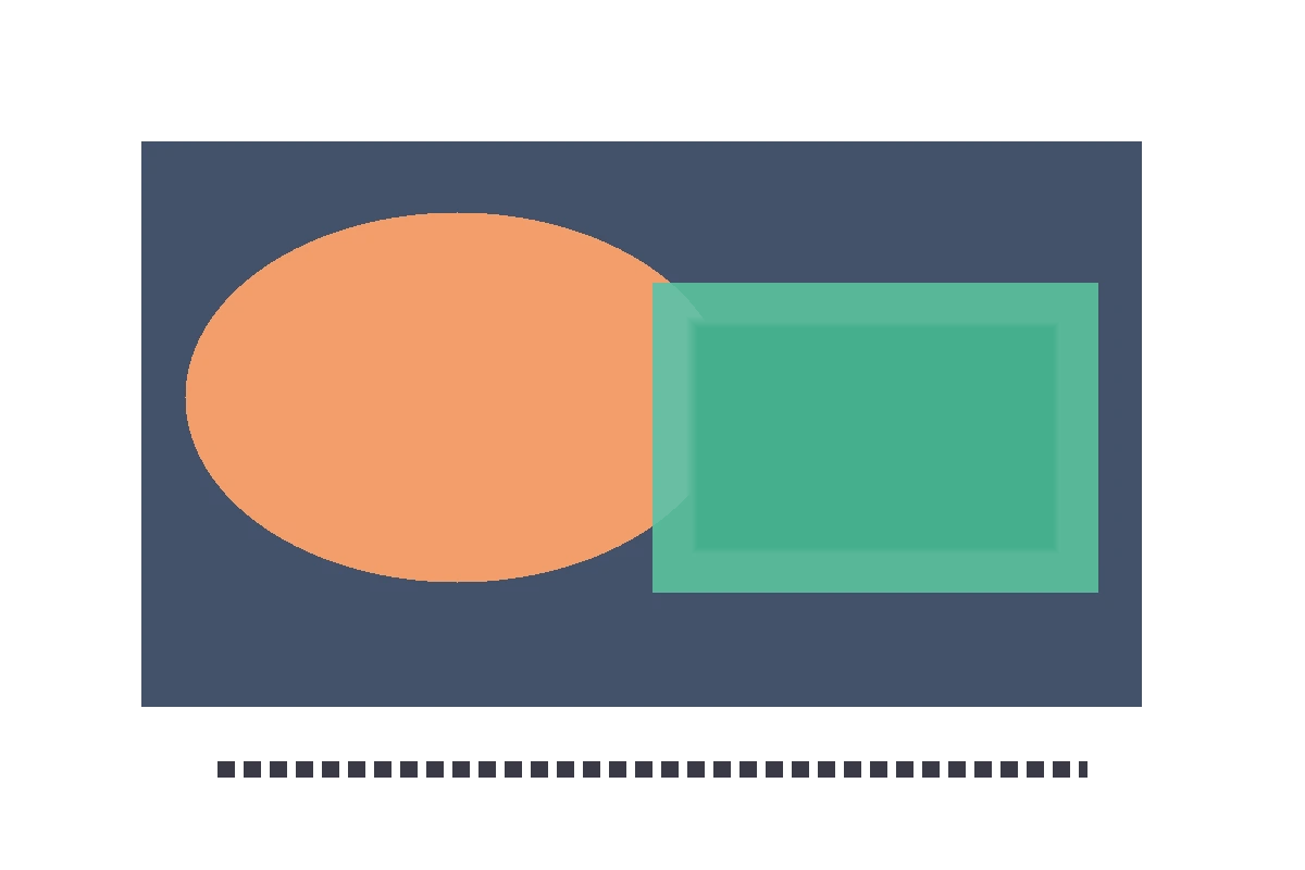
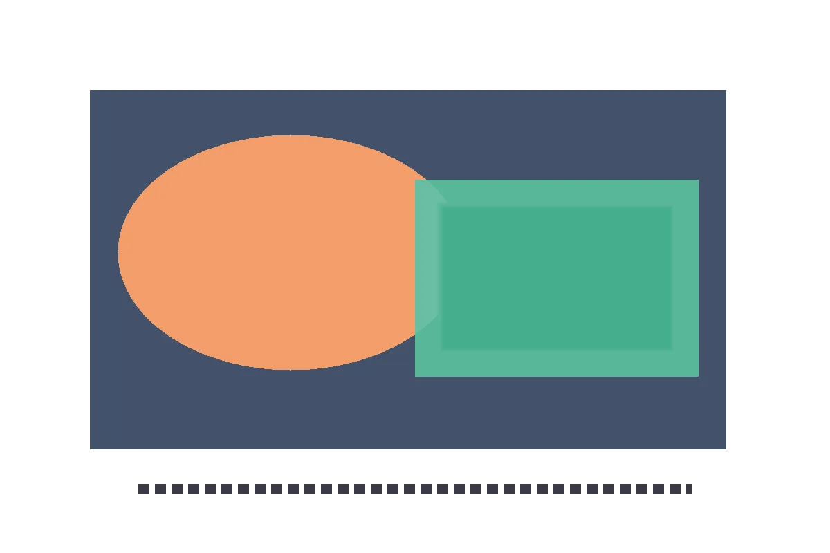
20260830. - Transparent graphic: 1,200 × 800, with opaque and semi-transparent shapes, sharp edges, a soft shadow, and alpha gradients.
Each fixture went through the QuickShed Image Format Converter in a browser. I converted every PNG to lossy WebP at quality 92 and quality 80. I did not run a lossless WebP conversion. I compared the browser-decoded output dimensions with the original, then calculated RGB mean absolute error (MAE) and alpha MAE over the decoded pixels. MAE is an engineering comparison for these fixtures, not a universal perceptual-quality score.
Visual examples
These previews are the six lossy WebP outputs from the same browser run. The PNG inputs remain the byte-size baseline in the table below.
UI screenshot-like
| Quality 92 | Quality 80 |
|---|---|
|  |
|  |
|
Photo-like
| Quality 92 | Quality 80 |
|---|---|
|  |
|  |
|
Transparent graphic
| Quality 92 | Quality 80 |
|---|---|
|  |
|  |
|
Measured outputs
| Fixture | PNG bytes | WebP quality | WebP bytes | Result | RGB MAE | Alpha MAE | Dimensions | |---|---:|---:|---:|---|---:|---:|---| | UI screenshot-like | 13,706 | 92 | 25,816 | 88.36% larger | 0.608 | 0 | 1,440 × 900 | | UI screenshot-like | 13,706 | 80 | 17,630 | 28.63% larger | 0.738 | 0 | 1,440 × 900 | | Photo-like | 4,805,954 | 92 | 815,922 | 83.02% smaller | 1.738 | 0 | 1,600 × 1,067 | | Photo-like | 4,805,954 | 80 | 540,810 | 88.75% smaller | 3.240 | 0 | 1,600 × 1,067 | | Transparent graphic | 8,857 | 92 | 9,666 | 9.13% larger | 0.447 | 0 | 1,200 × 800 | | Transparent graphic | 8,857 | 80 | 8,166 | 7.80% smaller | 0.490 | 0 | 1,200 × 800 |
The UI fixture is the clearest warning against using a blanket percentage: its PNG was already highly compressible because it contained large flat areas and repeated patterns. The transparent graphic shows a smaller version of the same effect at quality 92. Quality 80 reduced that file slightly, while the measured decoded alpha remained unchanged in this browser run.
The photo result is the opposite case. Its textured pixel field gave lossy WebP more room to trade pixel-level fidelity for fewer bytes. Quality 80 saved an additional 5.72 percentage points compared with quality 92, but its RGB MAE was also higher. Whether that difference is acceptable depends on the image and its display size; the byte saving alone cannot answer it.
A decision process that survives real assets
1. Separate the master from the delivery copy
Do not treat a WebP derivative as your only source when the image may be edited later. Keep the original lossless asset, or another explicitly lossless master, in your editing and archive workflow. Produce WebP as a delivery derivative after resizing and reviewing it at the dimensions users will see.
2. Match the encoder choice to the content
For a photograph, start with WebP and compare two or three quality settings. Look at skin, foliage, gradients, fine texture, and dark areas, not only the overall preview. For a screenshot or diagram, inspect small text, thin rules, icons, and repeated flat colors. If the WebP is larger or introduces distracting edge changes, keep PNG for that delivery slot.
For transparency, compare the image over the backgrounds that matter. A transparent file can have a numerically small error and still show a visible halo around a logo or shadow. The test’s alpha MAE was zero for both WebP qualities, but that result belongs to this fixture and this browser decode path; it is not a guarantee for every alpha edge.
3. Check dimensions and actual bytes
A conversion that silently changes dimensions is not an equivalent derivative. Confirm width and height, then measure the saved file. The claim that WebP is smaller is not a property you should assume after a conversion; it is a result you should record per asset or per representative class.
4. Keep compatibility explicit
If your audience includes older browsers, embedded viewers, or image-editing tools with uncertain WebP support, use a fallback strategy. A <picture> element can express a preferred WebP source and a fallback source when the browser does not support it. The right fallback is part of the delivery contract, not a reason to avoid testing modern formats entirely.
5. Do not turn image bytes into an SEO guarantee
Smaller images can reduce transfer work, but this experiment did not measure ranking, crawlability, or Core Web Vitals. It also did not compare every format or every device. Treat compression as one performance input. Measure the page in its real layout and loading path, and do not claim that a file-extension change guarantees search visibility or rankings.
What QuickShed proved in this test
QuickShed’s converter accepts an image file, reads it with FileReader.readAsDataURL(), draws it to an HTML canvas, encodes the selected target format with canvas.toBlob(), and exposes the result through a browser object URL. The product metadata describes this tool as file-only, offline: full, and retention: none; the component source contains no fetch, XHR, WebSocket, beacon, or storage call.
The browser run also recorded no external HTTP request after file selection or conversion and no request with POST data. The data: and blob: URLs used for the input and preview are in-browser resource references. The six outputs were downloaded through the browser UI and hashed locally. This observation is limited to this run; it is not a claim about every browser setup.
That makes QuickShed useful as a local test instrument here, but it does not make these six outputs a universal benchmark. The practical result is narrower and more useful: measure the actual asset, preserve a lossless source when needed, choose WebP when it wins on bytes without unacceptable visual change, and keep a fallback when your support policy requires one.
References
- W3C — Portable Network Graphics (PNG) Specification, Third Edition
- MDN — Image file type and format guide
- IETF RFC 9649 — WebP Image Format
Test scope: the reported byte sizes and MAE values apply only to these three synthetic fixtures, the QuickShed browser path, and the run dated 2026-08-30. No lossless WebP output was tested.